
I am glad to announce RioLinx’ first contribution to the awesome CodePlex Responsive SharePoint project. We owe a lot to Eric Overfield, D’arce Hess and Gilda Spencer of the PixelMill team for starting and developing this project that has garnered a lot of attention in the SharePoint community.
This project now highlights multiple releases, mainly around the integration of the 2 most popular responsive frameworks currently available, Twitter Bootstrap (2 & 3) and Foundation 4 (from our Zurb neighbors here in Campbell, CA). Those releases were great, but we couldn’t get them to work with SharePoint Foundation 2013 (which we mostly use here for our development needs) and the dependency on SharePoint Designer was a bit inconvenient, as we had to fix the links to the CSS and JavaScript files on each site collection where we uploaded the master pages.
We quickly felt it was a good idea to build “standard” SharePoint WSP solutions in order to streamline the deployment process and avoid lengthy customizations and manipulations in SharePoint Designer.
We first decided to build a SharePoint 2013 Foundation compatible version of the PixelMill project. Unfortunately we had to face some difficulties:
– In SharePoint Foundation, we cannot use the $SPUrl expression builder to reference our style sheets and scripts in our master pages, because it’s only available with SharePoint Server. We thus had no choice but to use references to files stored in the SharePoint 15 Hive (inside the layouts folder), and that meant our solution had to be a farm solution, not a sandboxed.
– We also had to figure out how to use responsive page layouts in SharePoint Foundation, because none of the default web part page layouts available with SharePoint Foundation are responsive. By looking at the way SharePoint Foundation implemented its page templates, we managed to build a custom Responsive Web Part Page content type that allow us to create pages based on a limited number of responsive page templates, also stored in a sub-folder of the _layouts folder.
Because we were limited by the number of page templates and because it is impossible for a site administrator to modify those page templates (as she typically doesn’t have access to the SharePoint server), we decided to provide a Publishing-like feature for SharePoint Foundation 2013 and to use it to provide page templates that can be stored in a SharePoint library and therefore be easily modified by a site administrator:
– We found the Mund Publishing Infrastructure (http://mundpublishingfeatur.codeplex.com/) but that solution is only compatible with SharePoint Foundation 2010. We thus first migrated it to be SharePoint 2013 compatible and modified it slightly to fit our requirements. This 2013-compatible version is available at http://spf2013publishing.codeplex.com/ and is strictly optional (though useful!).
– We then added 3 additional features to our solution to provide Bootstrap 2, Bootstrap 3 and Foundation 4 page layouts in a specific library of a SharePoint Foundation site (those features have a dependency on our SharePoint Foundation 2013 Publishing Infrastructure so you will need to deploy it before you can activate those 3 features). That, any user who has access to SharePoint Designer is able to modify and create new responsive page templates within a SharePoint Foundation site.
When we were done with this first farm solution, the PixelMill team motivated us to implement a solution that would be compatible with Office 365, since Office 365 doesn’t support the deployment of farm solutions.
Because we weren’t bound by the limitations of SharePoint Foundation, we were able to build a sandboxed solution which is compatible with both SharePoint Server 2013 and Office 365. By activating the Publishing Server features, we are able to provide both our responsive master pages and our responsive page templates in the ~site/_catalogs/masterpage folder. In this solution, any user with the permissions to deploy a sandboxed solution can easily and quickly build a SharePoint responsive site in minutes, as well as to add or modify these files by using SharePoint Designer.
Here is a list of additional improvements we brought to these solutions:
- Made all master page compliant with Minimal Download Strategy feature (see Bill Baer’s blog for an introduction to MDS)
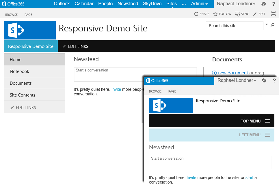
- Added the left navigation bar as a dropdown menu in mobile views (see below the “Top Menu” and “Left Menu” mobile dropdowns)
- Added 3-level sub-sites in navigation bar (in Bootstrap 3 only)
- Added OpenGraph support (only in the page layouts compatible with the SharePoint Foundation Publishing Infrastructure )
- Removed the search control when viewed on small screens
- Remove the right suite bar controls (Share, Sync, Edit, etc…) when viewed on mobile screens
- Remove the rather long Office 365 suite bar links when viewed on mobile screens
- Reduced the site logo image size when viewed on mobile screens
Below are some screenshots of the result, as seen in Office 365 (with Zurb Foundation 4). You can also glance at our bare bone Bootstrap 3 demo page on our public Office 365 site: https://riolinx365-public.sharepoint.com.
Last but not least, you can download the Responsive SharePoint WSP Edition v1.0 release at https://responsivesharepoint.codeplex.com/releases/view/114361 .