
PowerApps is a fantastic tool allowing Power Users to create applications with minimal code, quickly. However, as with many types of IDE, it’s very easy for it to become unmanageable and overwhelming as the number of screens, controls and complexity grows.
In this post, we’re going to examine several approaches that you can use to build your PowerApps making them far more maintainable, which will lower the cost of over the life-time of your PowerApp.
Let’s get started.
Tip #1: Use a good naming convention!
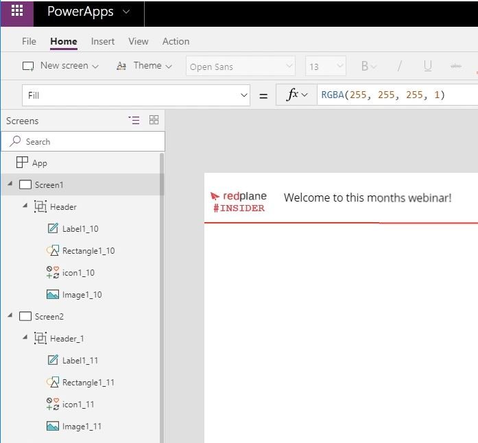
The first thing you should be doing in all of your PowerApps is to change the default naming of your controls to something more intuitive. (For example, we may want to call our header label, “Header-Title” as opposed to “Label1” and our “Header-Logo” as opposed to “Logo1”). If you follow an intuitive naming convention, you will not only find it much simpler to remember their names but also find that it’s much easier to refer to them when writing code against them.
In this first example, you will notice that the controls (within “Screen1” > “Header”) are named with the defaults that PowerApps allocates to them. If you then decide to copy them into “Screen2” (from “Screen1”), they are given unique names such as:
- Label1_11
- Rectangle1_11
- Icon1_11
- Image1_11
In one aspect this is good as all of your controls have a unique name, but in many aspects, this is awful because you won’t be able to reference them in code easily or more importantly find the correct one in the PowerApps IDE.
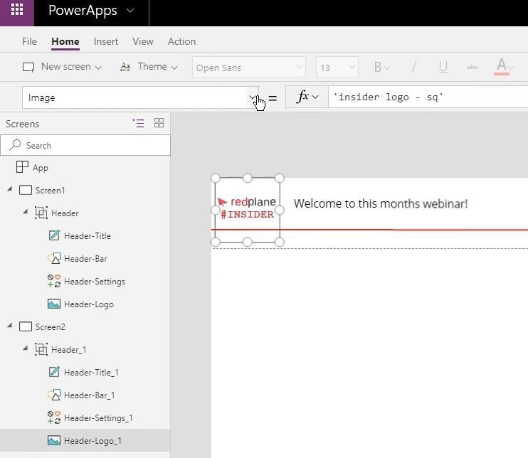
What I recommend here is that you name all of your controls correctly from the outset, then when you copy them, the first part will still allow you to identify their purpose more efficiently.
For example:
If you set your first header label to be “Header-Title” then when you copy it will be given “Header-Title-1”. If it makes sense, you may also choose to go one step further and change the number PowerApps appends to match the screen number or even the name of the screen.
Tip #2: Have one master of the truth!
If you create individual controls within a PowerApp and need to copy them across more than one screen, then it’s a real burden having to change them all as your requirements dictate. For example, imagine you have a header label that presents the ‘App Name’ and ‘Version’ across 10 screens within your PowerApp. You will need to set the position, colour, text (amongst other things), in all ten screens. If you then need to change the text to show a different version number and perhaps decide to go with a different colour, you will need click, edit and change in all ten screens. This can be extremely tedious, error-prone and time-consuming.
However, you will be pleased to know that there is a much better way of building your PowerApp, making it easier to maintain, which is what this second tip will cover!
Note: This second tip builds on from the previous one, because if you’ve named your controls adequately, then it helps to refer to them like I will show you now.
Firstly, let’s examine the main problem.
In the screen below, you will notice that there is a copy of a logo (which is an “image” control) used as a header on both screens (“Screen1” and “Screen2”). If you change the image used for the logo in either screen then it will not reflect in the other.
To solve this, you can simply refer the Image property to that of the Image property set in “Screen1”. So you’d set it to: ‘Header-Logo’.Image. This now means that if you change the image in the “Screen1”, it will also change in the “Screen2”.
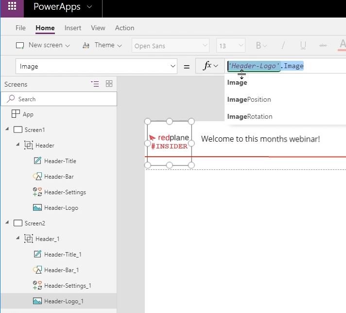
You can use this exact same process for as many of the control attributes as you wish to (e.g height, width, X, Y, colour, and so on).
Now the best bit. If you then copy the “Heading” from “Screen2” to a third screen (e.g. “Screen3”, you will notice that all the references are also copied, saving you even more time.
I am sure you will agree that this is a great timesaver in the long run, however, there’s still a problem:
- It is not obvious which item is being used as the “master” to which all the control properties are referenced.
- You can’t delete (or make major changes to) the “master” (e.g. “Screen1”) without breaking your entire application.
There is room for improvement!
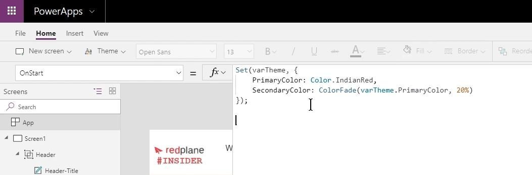
Tip #3: Create global references for objects
This approach is very similar to the previous but improves it a little further. With this approach, we create a centralised repository of values and settings that we can reference, similar in concept to a CSS file, an “App Settings” used in other applications such as ASP.Net. Once we’ve configured the settings we can use them time and time again and load them via our OnStart commands. Should changed be needed to any element in the future, we know exactly where to go and look for the master version.
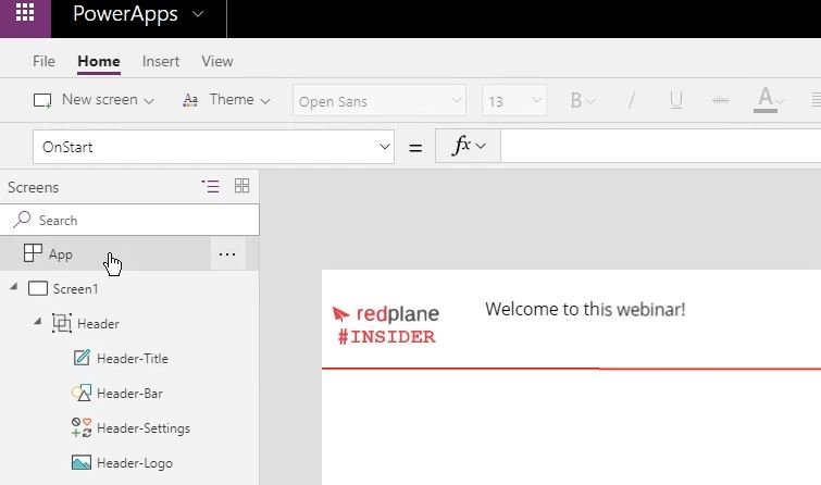
To create a centralised repository go into the “App” section and add your definitions using the “function box” for the variables we want to set.
In the example below, we can set our primary and secondary colours by creating a variable called “varTheme”.
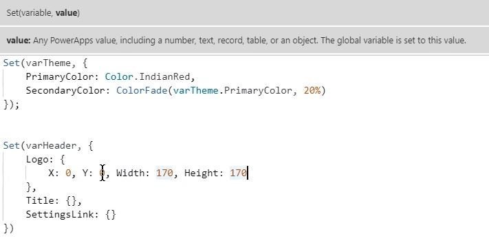
We could also add variables for our Header to accommodate the example used in the previous tip.
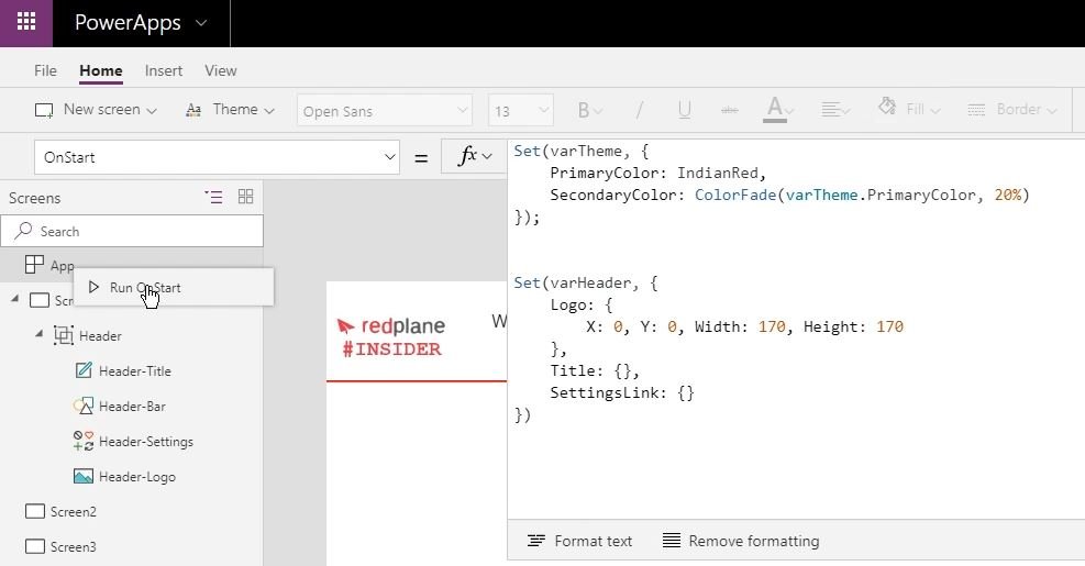
Once you have all relevant variables defined, you can ‘right click’ “Run On start” in the App menu, and this will run the code when the application starts.
How do we use our App setting variables?
Now we can amend the properties of the items in screen 1 to refer to the variable attributes saved in the centralised repository. For example, if you click on the “Header-Logo” icon and select the “Y” option as shown here:
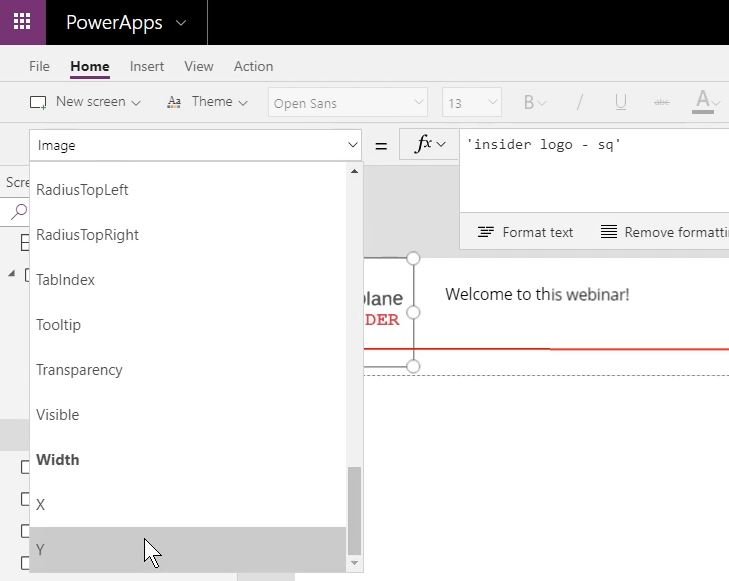
In the function box, we can change the properties (of the “Y” coordinate) to refer to the value we’ve already put in the central repository like this: “varHeader.Logo.Y”
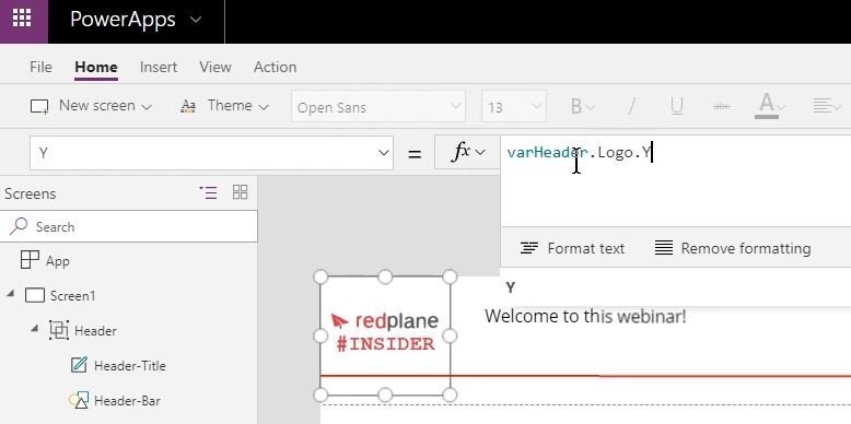
We can do the same for each of the other variables we set:
- X (varHeader.Logo.X),
- width (varHeader.Logo.Width), and
- height (varHeader.Logo.Height).
This will set the variables for our initial logo to those saved centrally, so when you copy the heading onto subsequent pages, they will also refer to the centralised values. Should you need to change any of the variables, updating them in the centralised repository will flow through into all instances.
The same process can be completed for all other items you wish to display.
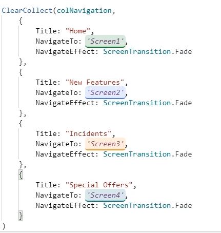
Tip #4: Consistent navigation
The “ClearCollect” function clears the previously used values and replaces them with values we specify (if we only used “Collect” the existing values would be kept and more items added to the collection). This can be used to standardise the navigation options within our application. Again, we set the parameters within the same centralised repository we used in the earlier example ensuring that we have defined all of the navigation options we want to use.
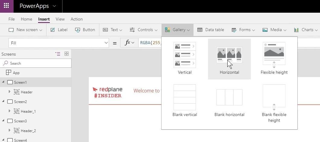
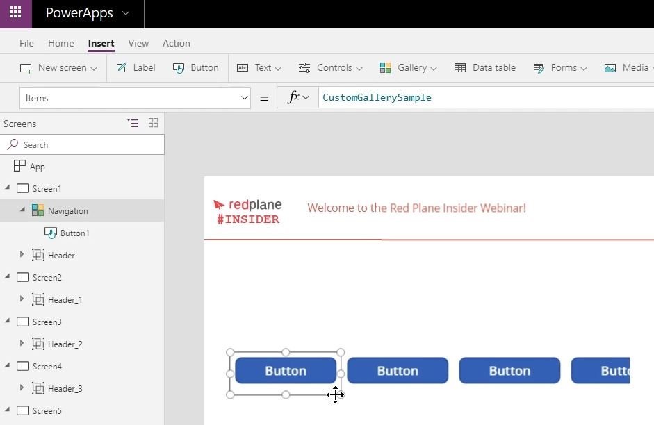
Insert a “Horizontal” gallery to “Screen1” and resize or move it to fit into the available space.
Rename the gallery to “Navigation” and delete the default features as we don’t need them.
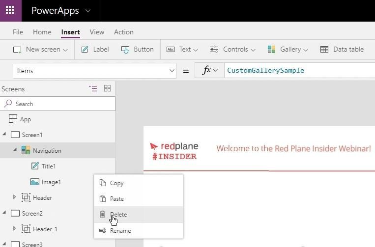
Now insert a button into the gallery and resize the button. Notice that the gallery has automatically connected to the “CustomGallerySample” however we want to use our “colNavigation” settings that we created earlier so we need to change the function box to “colNavigation”.
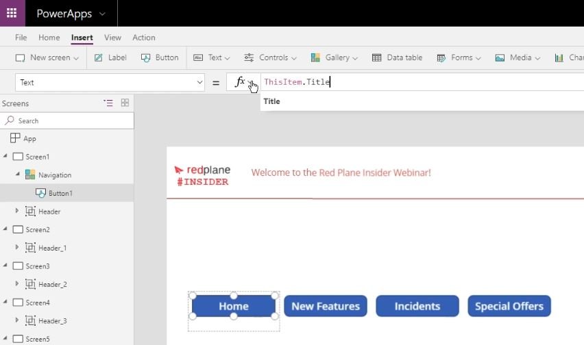
Now click on the first button and select “Text” from the drop-down box on the left (it will probably say “OnSelect” at first), then add “ThisItem.Title” into the function box as shown below which will pull through the title descriptions for each button in turn that we included in the ClearCollect instructions.
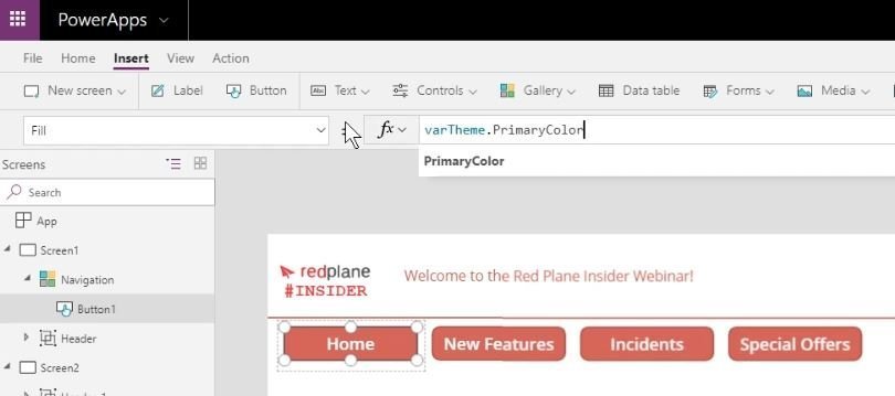
We can also use the colour definitions we have stored in our Theme above. Select the first button, choose “Fill” from the drop-down parameter box and enter “varTheme.PrimaryColor” in the function box & all of the buttons should now reflect our preferred primary colour.
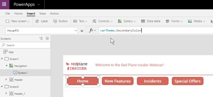
Using the same process we can change the style of the Hover text display to use the secondary colour.
We also need to set the navigation destinations that should be used when the button is clicked, so we need to define the “OnSelect” destination. In the function box for OnSelect insert Navigate(ThisItem,NavigateTo, ThisItem.NavigateEffect)
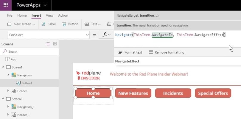
Now if you copy the navigation gallery into other screens, each time you use a button it will always go to the same place using the same transition effect.
Additional tips
1. If you think that you may change the size of logos or other items in the future, then you can build in the flexibility to automatically move other objects around them so they don’t overlap or get hidden if something in the chain moves by dynamically assigning starting X positions.
For example, we may have an image to the left and a heading description to its right. If you fix the X & Y coordinates for both items, it’s possible that one may cover the other if its size changes.
We can fix that by making the coordinates of the heading on the right to depend on the size and position on the logo to its left. In the example below, the starting X position of the Title is calculated by adding the starting position of the logo to its left, the width of the logo itself plus the size of gap required between them before the header begins.
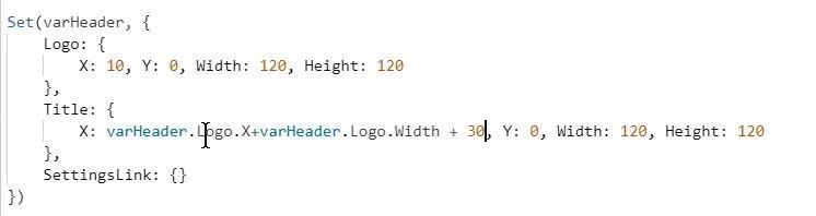
Should the logo change size at all, the heading will automatically move across for them both to fit.
2. If you do dynamically assign positions as above, you may need to click “Run OnStart” a few times to see them all change. The first Run OnStart will reflect changes to the first item, the second time Run OnStart is used it will amend all the items that are dependent on the position of the first item.
3. Don’t worry if the content disappears from view whilst you are amending their properties – if you click “Run OnStart” they will reappear.
4. Generally the more properties you set for the variables the better.
5. Remember to put a semicolon (;) in between Set commands, but not at the end of the last one.
6. When setting values for colour, Color refers to text, Fill refers to the shape or area.
7. Ensure you have set all of the variables you need before copying an item (if you forget one, you’ll need to add the attributes to the central repository and also add references to it in each of the copied locations).
8. When copying items to other pages, make sure you copy all elements (i.e. copy the entire Header) not the constituent parts (i.e. Header title, Header logo and Header settings etc.) to make the process as efficient as possible.
Bonus Material: PowerApps Canvas Components
This is a new, experimental feature so is subject to change going forward but could replace some of the things we’ve looked at in this post. Please be wary of using them as if they do change in the future it could break the apps you create today.
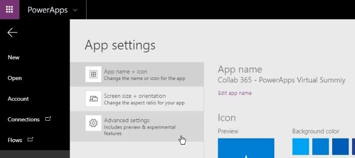
First, we need to turn on the component, so from the File menu, chose App settings, then Advanced settings.
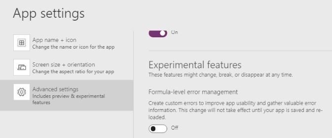
At the very bottom of the Advanced Settings list, you’ll find the Experimental features, and at the bottom of this list is the Components setting which you need to turn on.
This is an App level setting, so if we export components out of this app into a different application, you would also need to turn on the Components features in the second application as well. Note that if you subsequently update the component in the first application, these changes will not be reflected in the second application the component was copied to, you would need to make the changes again.
Once the components setting is turned on, new options can be seen on the page (a components option next to screens and components drop down options in the Insert menu). The option to create a new component can be found in both of these menus.
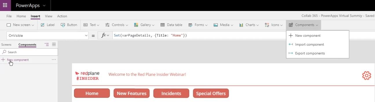
Create a new component & call it “Connected”.
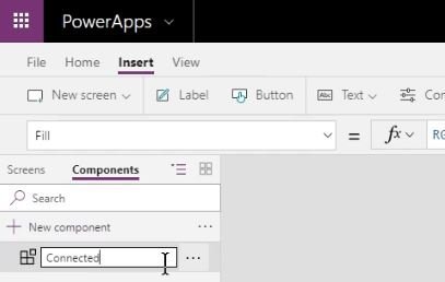
This will create a new area in the middle of your screen to add the component to. Start by adding a rectangle (from the Icons menu) and resizing to fit the screen.
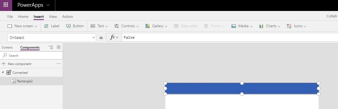
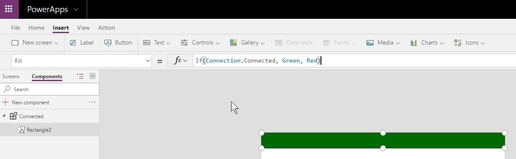
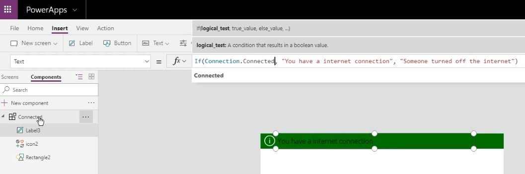
To make this bar be coloured green if connected to the internet or red if disconnected, we need to use an if formula as follows. If(Connection.Connected, Green, Red) . I’m currently connected to the internet, so the rectangle correctly automatically changes colour to green.
To make the display more informative, we can also add an information icon (again resize it to fit) and a Text field to add more detail… If(Connection.Connected, “You have an internet connection”, “Someone turned off the internet”)
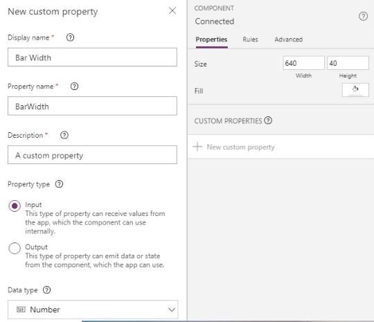
This component can be given custom properties, so change the display name, property name and set the data type to Number as below.
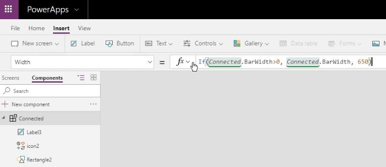
Now we can set the values for the components
We can then add this connected component into our original screen,
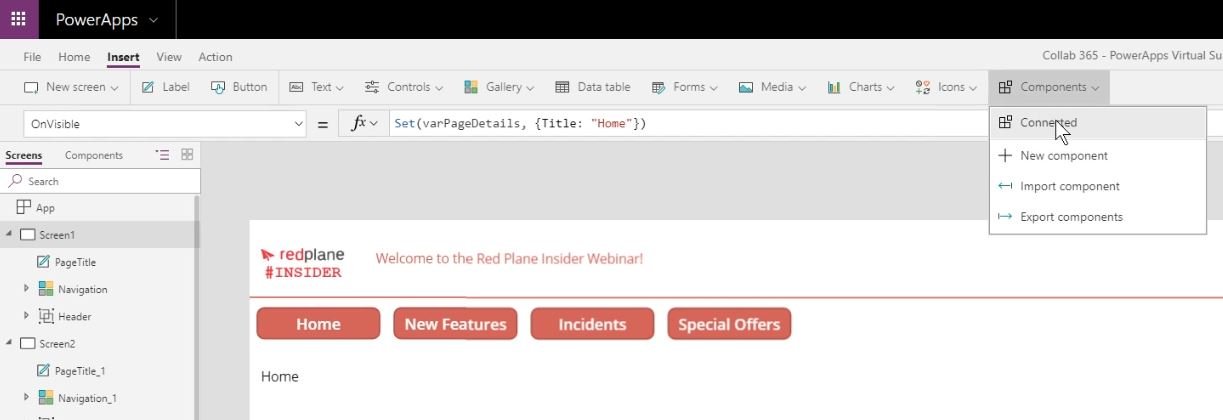
Which will add it to the top left corner of the screen, you’ll need to drag and resize it to wherever you want it to be displayed.
A few caveats for the use of these Canvas Components:
1) Instance: A master instance of a component is scoped to the app. It is a local master.
2) Images: It is not yet possible to package media files when importing a component, but this feature is coming soon.
3) Collections: Using Collect within a component is not fully supported.
4) Data Sources: These are not saved with components.
I hope you’ve found this useful and can use these approaches to save you lots of time going forward when developing applications.
If you would like additional help, I’ll be more than willing to do so, I’m available on the MicroJobs site with the freelancer name MarkS.