The difference between a successful Power app and one that people won't use can be small margins. Thinking about user interaction is a really important step.
If you get the controls and layout right, people will happily use your app and happily come back time and time again. Get it wrong and the first time they load it up will be the last.
In this blog. (part of an upcoming series). I'll share the first of the techniques I have used to help improve the user experience. This is about marginal gains which increase engagement by tuning the user interface.
What's the out of box Power Apps experience like?
Power apps come with many different controls to interact with your data. In seconds, you can create fully functional apps that house controls to read, update and change the data that drives your business process.
Some controls perform brilliantly out of the box. Some are functionally perfect for their intended purpose. However, Sometimes the look and feel aren't quite what you hoped for.
And this example, I'll show you how using a dropdown list to represent a choices field in SharePoint may be something you'd like to experiment with.
Instead of the dropdown experience, I replace it with checkboxes to achieve two things:
- The first is to provide immediate feedback on the items that have been selected in the choices field.
- The second is a more compact and clean user experience. Taking up less of the mobile device, real estate.
Step 1 - Use An Existing Form to Interact with Data
In this example, I have kept it simple and you use the SharePoint list to host my data.
Any data source will work as well so long as the field or column that you're surfacing contains choices.
- I already have a Form on the screen. For this set of steps, it's important your Form already works and is connected to Edit your data source. Building the Form from scratch involves some slightly different steps which aren't covered here.
In the properties window on the right-hand side, you can see my working choices column already selected for the Form. The one I have used is called "Platform"
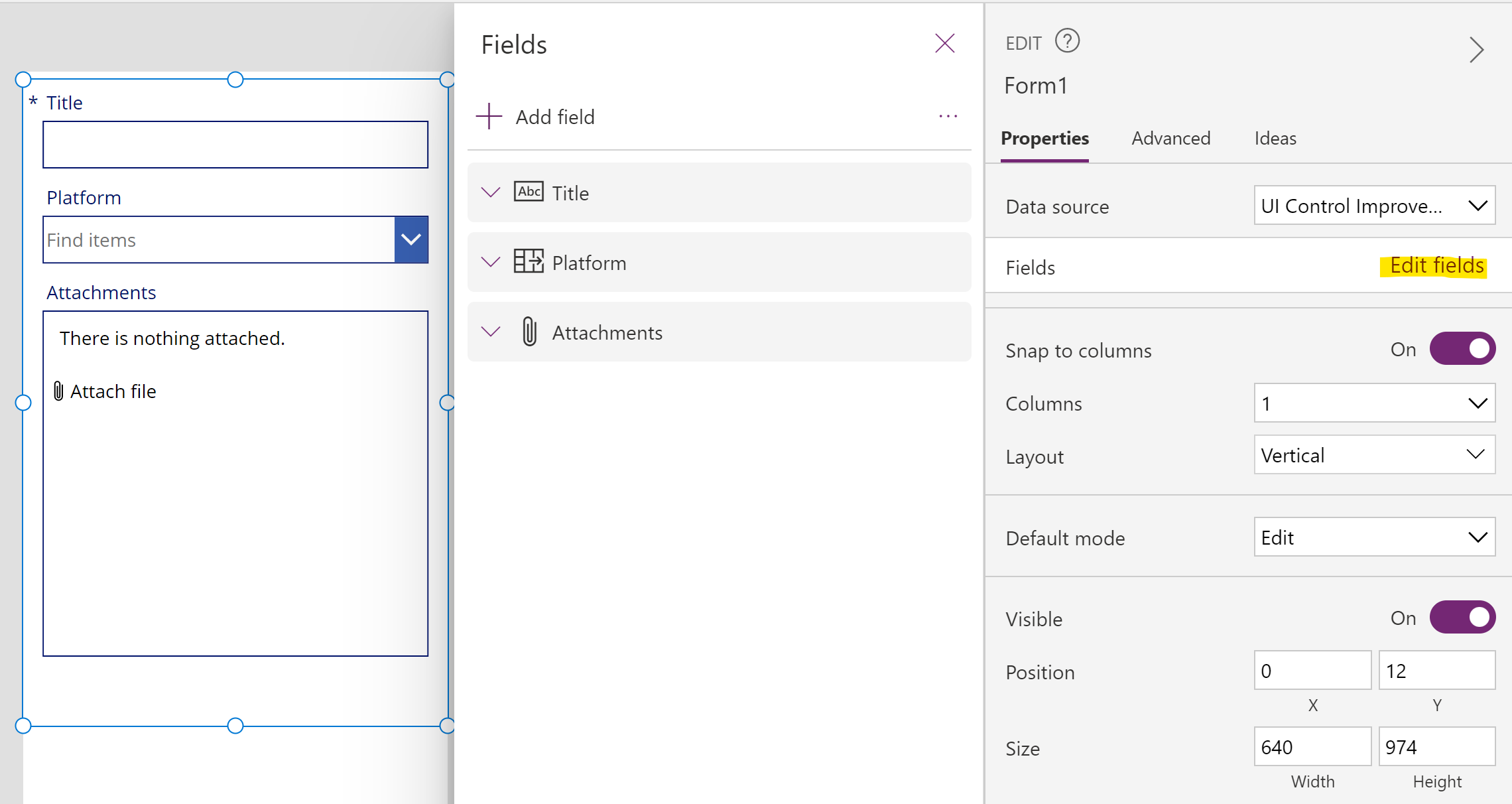
Notice the Platform field has defaulted to a drop-down list. In SharePoint, I have five choices configured. I have also set the field to accept multiple selections. This is when it becomes more problematic.
You can select one or more items within the list when you press Play.
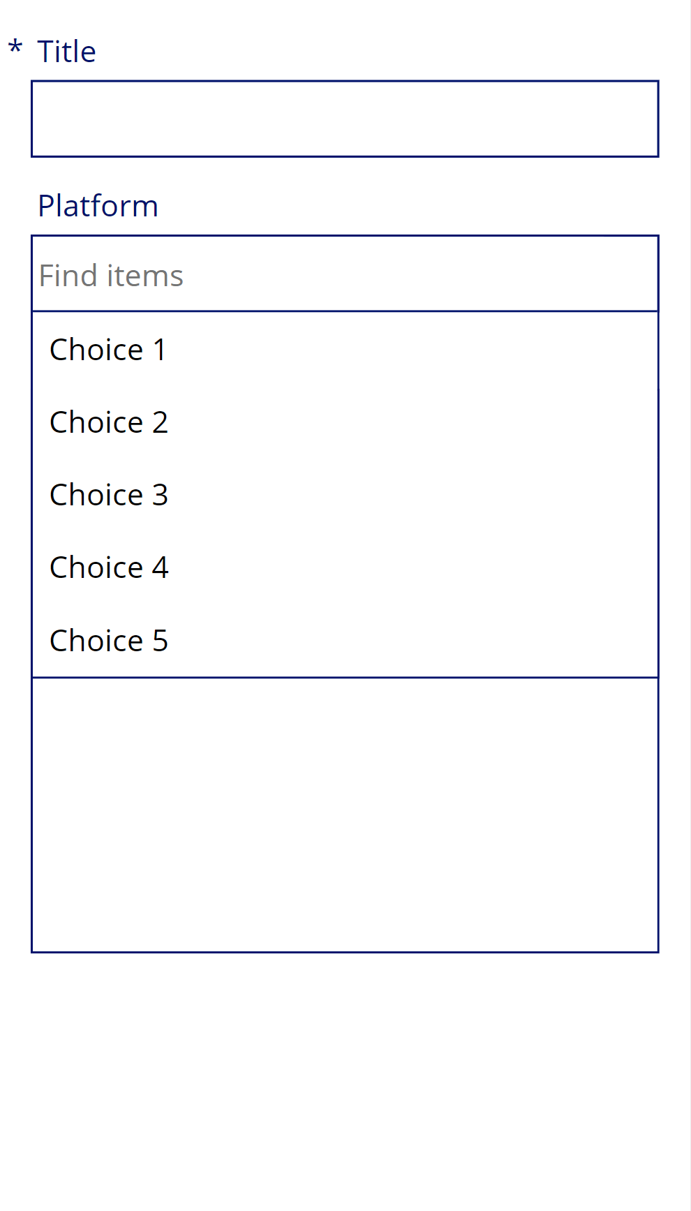
The problem with this control is that when in use, as you can see in the image, a lot of the screen is taken up.
Sometimes (if there are multiple choices, it will obscure other screen elements temporarily.
As you can see on the right-hand side, I have lost the ability to review the name of the attachment when I select the choices Drop-down (it's underneath the Choices drop-down)
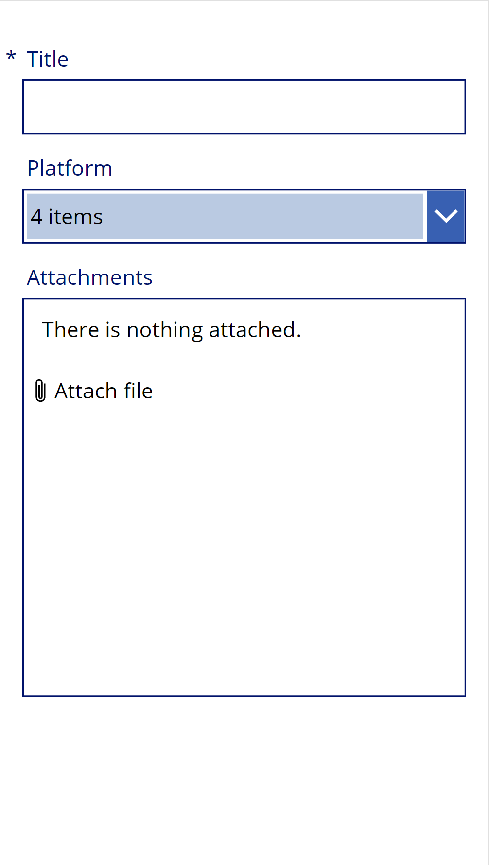
In addition to this, when I select multiple choices. Eventually, the user feedback I get will simply be a number. I have to open the dropdown again to find out which items I chose.
This is fine for data I enter but what If I want to quickly review information. Performing the extra click will get annoying if I have to do it repetitively.
For these two reasons, I want to change the user interface.
Step 2 - Introduce Check Boxes
The first. First step in adding a checkbox. It's to unlock the data card for your choices column.
- Select the data card
- Using the three dots, select Unlock
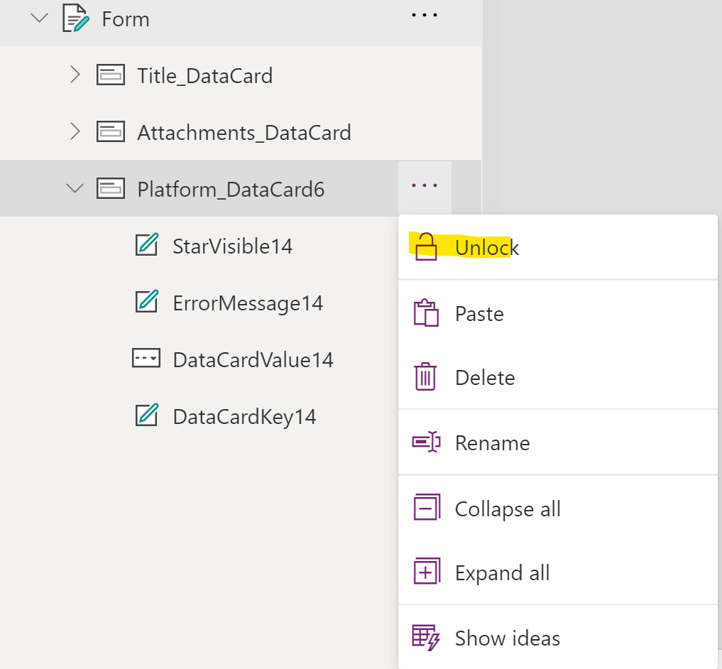
- Now you've done this, you can edit the data card
- Using Insert > Input and select Checkbox
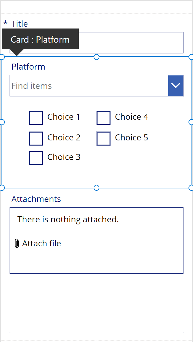
- I have added 5 check-boxes to correspond to the number of choices in my choice column
- Next, make sure each represents a choice in your SharePoint list. Do this by changing the Text property to match the value of a choice in your SharePoint column. For example, my first checkbox Text property is "Choice 1"
- Repeat this for all the items in your choice column
- Make sure the checkboxes sit underneath the data card header (so they are part of the data card)
Pro Tip
Re-Name your check box controls. This way, you'll understand which Choice in your column each relates to.
Step 3 - Setup the Check Box behaviour
Now you have checkboxes on-screen relating to each choice. You'll need to make them behave in a manner that reflects the original behaviour of the dropdown.
To do this, use 2 of the properties which represent an event or action that is performed on a checkbox. When the formula in each event is triggered, you will add a value to a Collection.
A Collection in power apps is just a temporary store for information. They gather together multiple values of the same type and can behave like an array or a table.
You can choose items from your collection. Perform actions (like check for string) using the whole collection, add and remove values and more.
The properties of the Checkbox we will use are :
- OnCheck
- OnUncheck
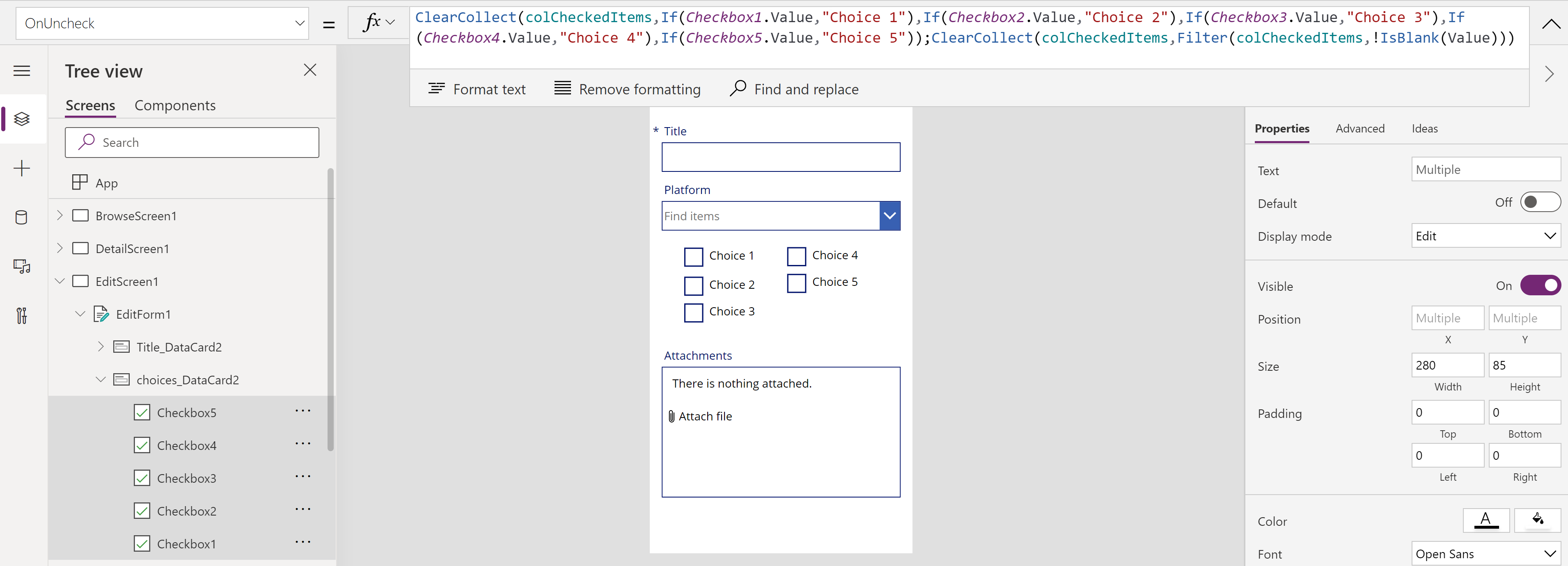
Here's the formula that you'll paste into every checkbox within these 2 properties:
ClearCollect(colCheckedItems,If(Checkbox1.Value,"Choice 1"),If(Checkbox2.Value,"Choice 2"),If(Checkbox3.Value,"Choice 3"),If(Checkbox4.Value,"Choice 4"),If(Checkbox5.Value,"Choice 5"));ClearCollect(colCheckedItems,Filter(colCheckedItems,!IsBlank(Value)))
pro tip
Update Multiple Controls at Once
Hold down shift and select the controls you want to update. Now select the property you want to update for them all. Paste the formula needed (same for each). This will update every control you have chosen quickly
To give you some understanding of the formula, you are collecting text values into an item called colCheckedItems (a collection) based upon a condition that must be true within each checkbox control.
- I have named each checkbox 1-5.
- The If(Checkbox1.Value, "Choice 1") statement mean that if there is a value (a tick) in Checkbox 1, then write "Choice 1" into the collection
- Simply by using "Checkbox1.Value", as the logical test, behind the scenes Power Apps is looking for a Value in this control and evaluating the statement to be True if it finds one. The statement directly after this logic lets Power Apps know what to add to the Collection. There is no False value to add which is why there is no second comma in the if statement (you don't need to add anything unless you want a different value when the logical test returns false.
It may appear confusing at first but once you are familiar with the structure of the formula, it becomes very useful to use this shorthand.
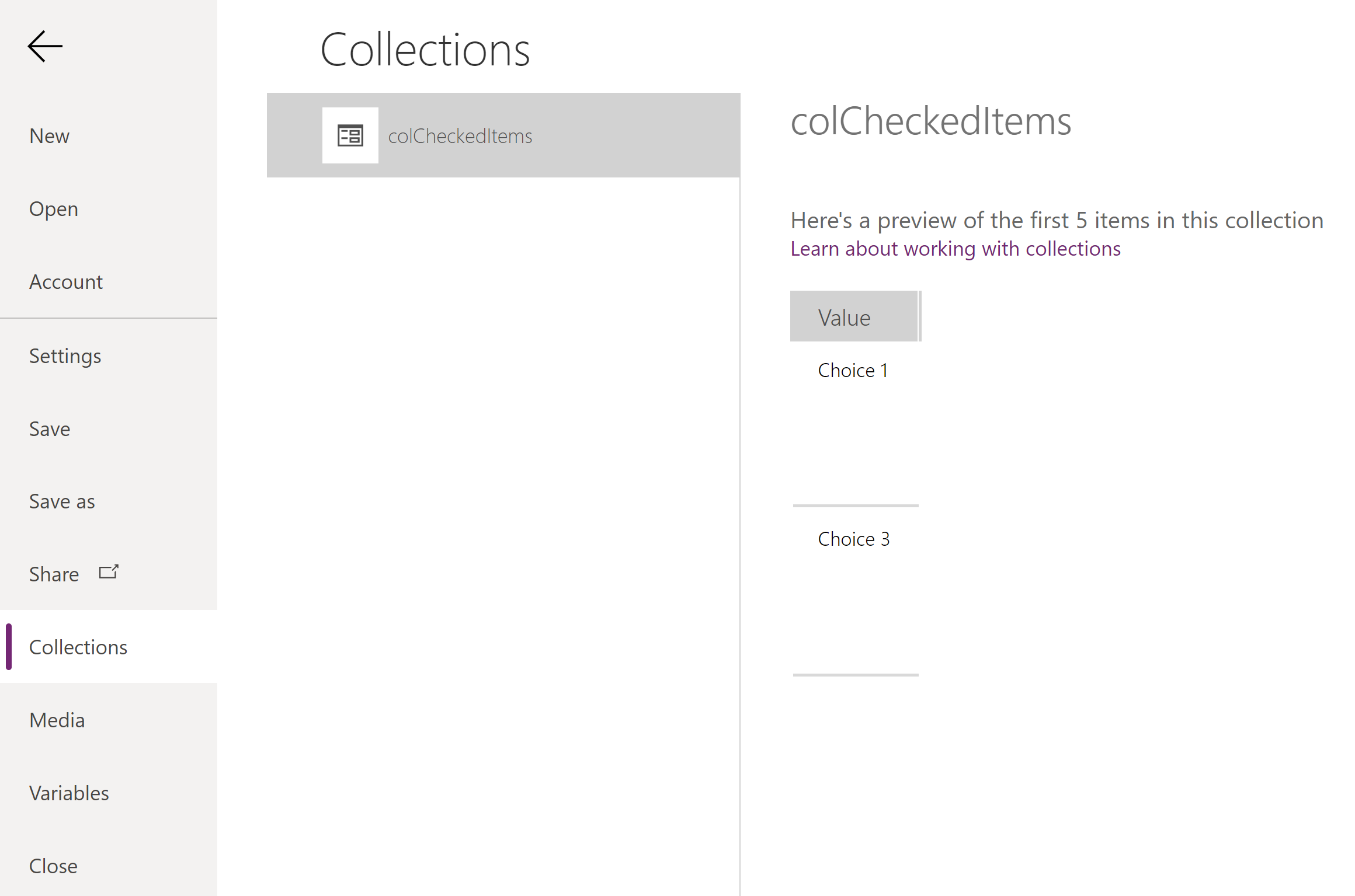
Once this has been completed. Check that your collection is being updated correctly by pressing play (or use the Alt key) and click various combinations of checkboxes. View the result in the View > Collections menu.
Step 4 - Complete the Update to the SharePoint list
Once those formulas are in place, you are almost complete.
The final change to make is to make sure the collection values are added to the form when it is submitted to the SharePoint list. Do this by changing the Update property of the Choices (in my example its called "Platform" data card to contain your collection name e.g colCheckedItems
Now that works, you can set the Visible property of the actual drop-down box to false (as in the left hand image below).
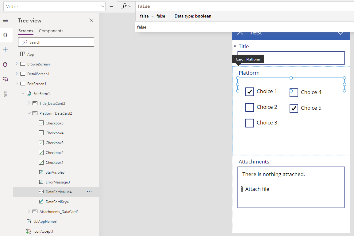
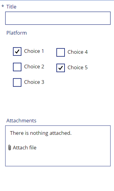
You may also like to move the checkboxes around to match your preferences. For the example, I have not tuned them but you could think about the following to improve the user experience:
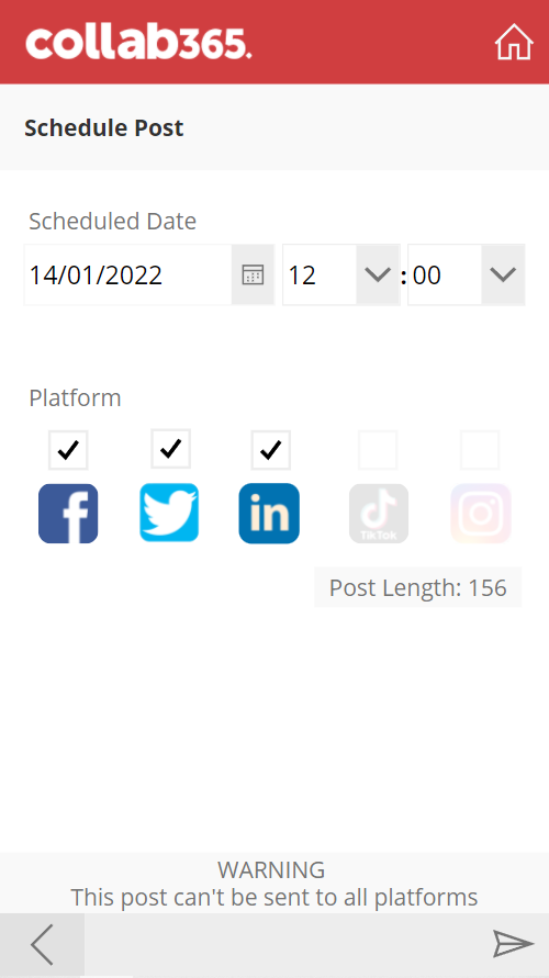
- Trim off the text and add images to represent the checkbox options
- Use Variables to control the Displaymode property for checkboxes - make them disabled or available depending on another condition
- Test what layout works best for your planned screen size
As a final example, here's what we have done in our App "The Social" which handles posting to social media for us.
If you like this post and found it useful, leave a comment or like on one of our social channels. I'd also love to hear how you have tuned your user experience for your teams to encourage them to interact and use Power Apps you've built. Thanks for reading!


