
My last post was all about improving engagement using a simple and intuitive visual to share key information quickly and without extra clicks. Have a look here if you haven't already.
In the second part of the series on building effective UI in Power Apps, I'll zoom out a little and focus on 5 simple guidelines to use in your Power App build.
Today, the focus is on the goal of let your UI 'Breath'. That's a phrase you'll hear time and again in the design world but it's surprisingly easy to implement. I'm cutting this topic up into 5 minute reads so watch out for the next post in the "5 in 5" series!
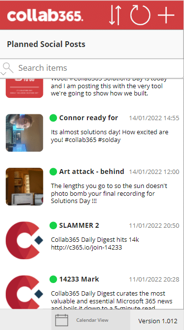
In the example Power App below, the layout isn't terrible but there are some subtle changes to make so the users eye is presented with less information to digest before they take an action.

Step 1 - Remove unnecessary Information
In the app above, the footer contains version information. In the context of a power app, that doesn't really provide a lot of value to the user. Why take up the precious vertical space ? For a power app, usually you have promoted and published a version in your production environment. That means as a citizen developer, you have ultimate control over what's out there in the wild.
Power Apps are unlike other apps where people actually downloaded to their mobile device. They are served centrally from your tenant so there really shouldn't be multiple versions in use at any one time.
See the change we made, it's small but as you will see, these small changes accumulate when we do a side by side at the end.

Step 2 - Size Is Important!
There are guides out there for items like icons and buttons. In the case of minimum touchable areas for mobile devices, I'd recommend not going too large but not going below 40-48 pixels for touchable area. Apple or Android (and others will have their own specific recommendations but generally, I like to aim for around the mid to high 40's depending on my needs.
Here's how it improves my header by adjusting the height and width properties for the icons to 48 pixels.
Step 3 - Give Focus To the Primary Action
It might seem counterintuitive for the mission of letting the UI breath that we are actually going to take up more space with a button rather than less. However the aim is to give the primary action the space and prominence it needs and therefore help the user of the Power App get there quickly.
Simplifying the footer, giving much more of the bottom space to the submit action, we are sending a signal to the user that this is the main action in that area.
The back button is valuable but the main thing we want to focus people on is a Submit Icon. People expect this when they are on this screen so we are giving it to them clearly and with focus.

Step 4 - Let the Icons Do the Talking
We are all so used to using mobile devices and apps now that we have an element of muscle memory for icons and common actions. That fact can be exploited when you are designing an app. You no longer need to explain what all your buttons or icons do because people are just so used to them now.
That means you can save space where you have an icon and text so long as the icon speaks to the action you intend e.g don't use an X if you want someone to save.
For our app, we took away some unnecessary text because we know that people expect some sort of calendar or event view when they see the icon we used. Look how much space it frees up and how much simpler it feels.

Step 5 - Remove unnecessary Chrome (borders and scrollbars)
We don't really need extra UI 'chrome', such as the border around most of our items and removing it cleans up the visual and allows the eye to focus much more easily on the areas you want it to. It's good to have the border between scrollable items sometimes but even that can sometimes benefit it removed.
In our Social app, we set all our BorderThickness properties to 0 for simplicity. We like the effect it had so kept all our galleries like this.
What's the Overall Impact?
Taking in all the changes we have made now
Vs

I'd love to hear any ideas you have around UI and look forward to any comments or feedback. Cheers for now.


