

Most Power Apps LMS prototypes start with the lesson screen.
That feels sensible. The lesson is where the learning happens, so you add a title, some content, a progress label, and a button that says Mark complete.
Then the awkward questions arrive.
Where does the learner find the lesson tomorrow? How do they know which course version they are taking? What happens if they have three assigned courses? Where can they see what has been recorded? Who can edit the course, and how do those changes reach learners without quietly rewriting history?
We ran into exactly this while building our own small Power Apps LMS prototype. Tidying the lesson screen helped, but it did not solve the real design problem. A convincing LMS is not one polished page. It is a set of connected surfaces, each answering a different question for the learner or course owner.
This is the guide we should have written first.
The five jobs your LMS interface must cover
We did not invent these jobs from a blank canvas.
Look at established learning platforms and the same patterns keep appearing in different clothes. Canvas gives learners a dashboard with course work, calendar events, announcements, modules, and grades. Brightspace combines assigned learning, a table of contents, previous and next navigation, completion indicators, and a separate progress view.
That does not mean you should copy either product. It means learners repeatedly need to do five things:
| Interface area | The question it answers |
|---|---|
| Learner home | What should I continue or do next? |
| Course overview | What is this course, how is it organised, and where am I? |
| Lesson workspace | What am I expected to learn or do right now? |
| Progress and evidence | What has been saved, and what counts as complete? |
| Course management | What can an owner change, validate, and publish? |
A shared app shell sits around those areas. Loading, empty, error, and permission states sit underneath all of them.
That is the architecture. Buttons, colours, icons, and cards come later.
Start with the records, not the screens
Before drawing anything, write down the objects the interface needs to represent.
For a narrow workplace learning app, a useful starting model is:
- Course, the stable identity and purpose of the learning;
- Course release, the version learners are actually assigned;
- Lesson, an ordered unit inside that release;
- Enrolment, the relationship between a learner and a course release;
- Lesson progress, the learner's state for one lesson;
- Course evidence, the record created when the release-level completion rule has been met.
You may store these ideas in separate Dataverse tables, combine some of them for a very small prototype, or prove the interface first with fictional collections. The important thing is that the concepts remain distinct.
If the screen cannot tell the difference between a course, its current release, and one learner's progress, the visual design will eventually lie to somebody.
You do not automatically need discussions, certificates, badges, quizzes, due dates, manager approvals, or a catalogue. Add a feature because the learning job requires it, not because another LMS has a menu item for it.
The Power Apps building blocks that fit this job
Power Apps does not have a single LMS control. It gives you a fairly small set of useful pieces:
- Vertical and horizontal containers for the page shell, responsive regions, cards, and action rows;
- Galleries for repeating records such as courses, lessons, enrolments, and evidence history;
- Display forms for showing a selected record and edit forms for controlled editing;
- Components for repeated interface patterns such as the app header, course badge, progress strip, status message, and empty state;
- Labels, buttons, icons, inputs, images, and media controls for the actual learning interaction;
- Navigation and app state to carry the selected course, lesson, learner, or release between screens;
- Data sources and security roles to decide which records a person may read or change.
Microsoft describes galleries as controls that show multiple records from a data source. Forms display, edit, or create a record. Components are reusable building blocks, and component libraries are the recommended route when those building blocks need to be shared across apps.
That is the palette. Here is how to assemble it.
1. Learner home: help me find the next useful thing
The learner home is not a miniature reporting dashboard.
Its main job is to help somebody resume without having to remember what they did last time.
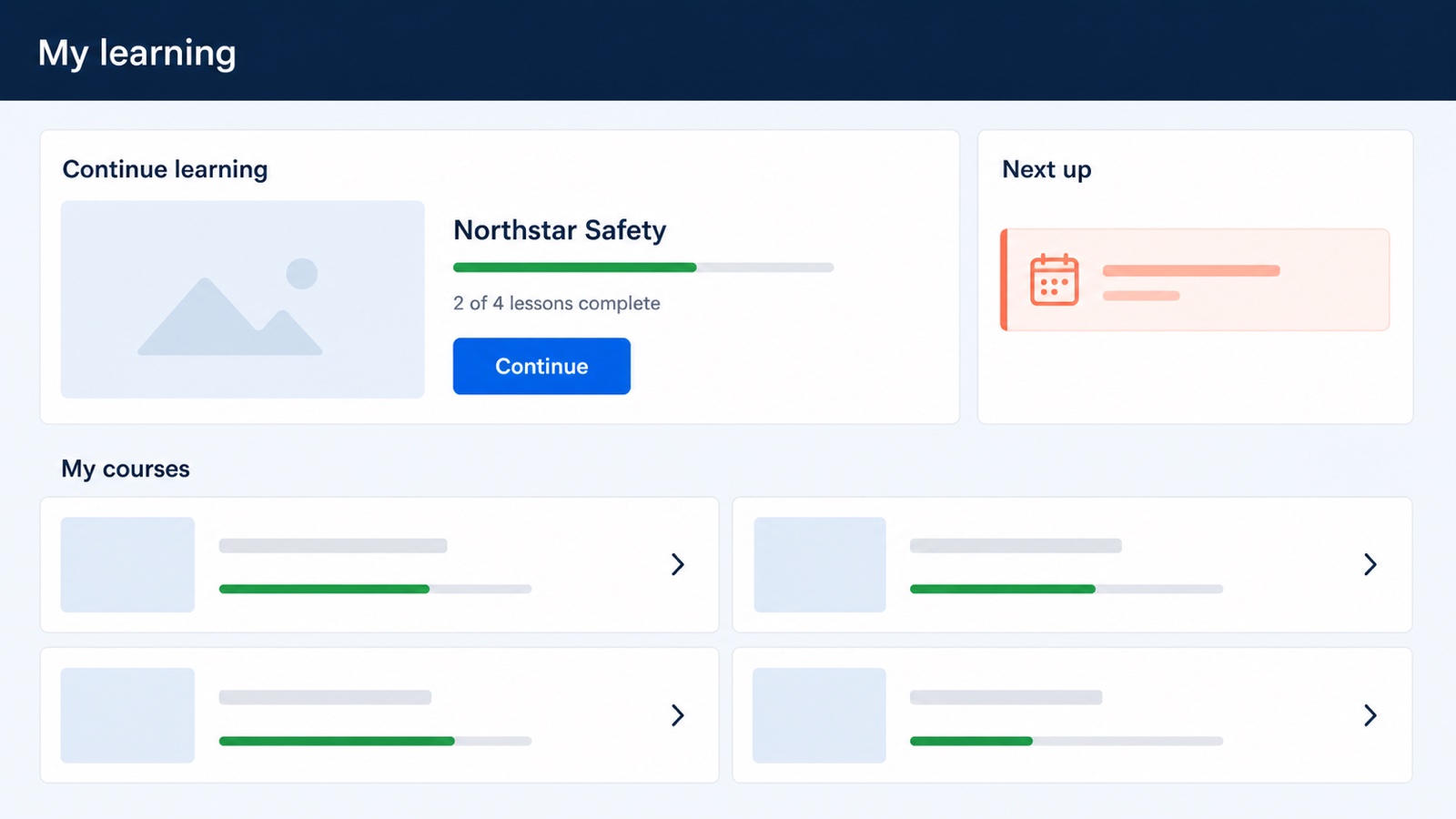
Concept mockup. This is an AI-generated design aid, not a screenshot of a finished Collab365 product.
A good learner home usually needs:
- one obvious Continue learning action;
- a gallery of assigned or available courses;
- progress shown in words as well as colour;
- the next required activity, if the learning has dates or sequence rules;
- honest states for no assignment, nothing started, completed learning, and a failed data read.
How to put it together in Power Apps
Use a top-level vertical container for the screen. Inside it, place a horizontal region for Continue learning and Next up, followed by a gallery for the learner's courses.
The gallery template can contain the course title, release or status, progress text, a visual progress indicator, and a button or selectable row. Keep the template simple enough to scan at a glance.
Do not calculate the learner's next action separately in six different controls. Decide what "continue" means once, then let the hero card and course row point to the same selected lesson.
The common mistake is filling this screen with counts because counts are easy to add. "Four courses, seven lessons, two completed" is less helpful than "Continue Northstar Safety, lesson 3".
2. Course overview: make the route visible
Once the learner chooses a course, they need a map.
This screen should explain the course purpose, show the current release, make progress understandable, and expose the lesson sequence without dumping the entire lesson onto the page.
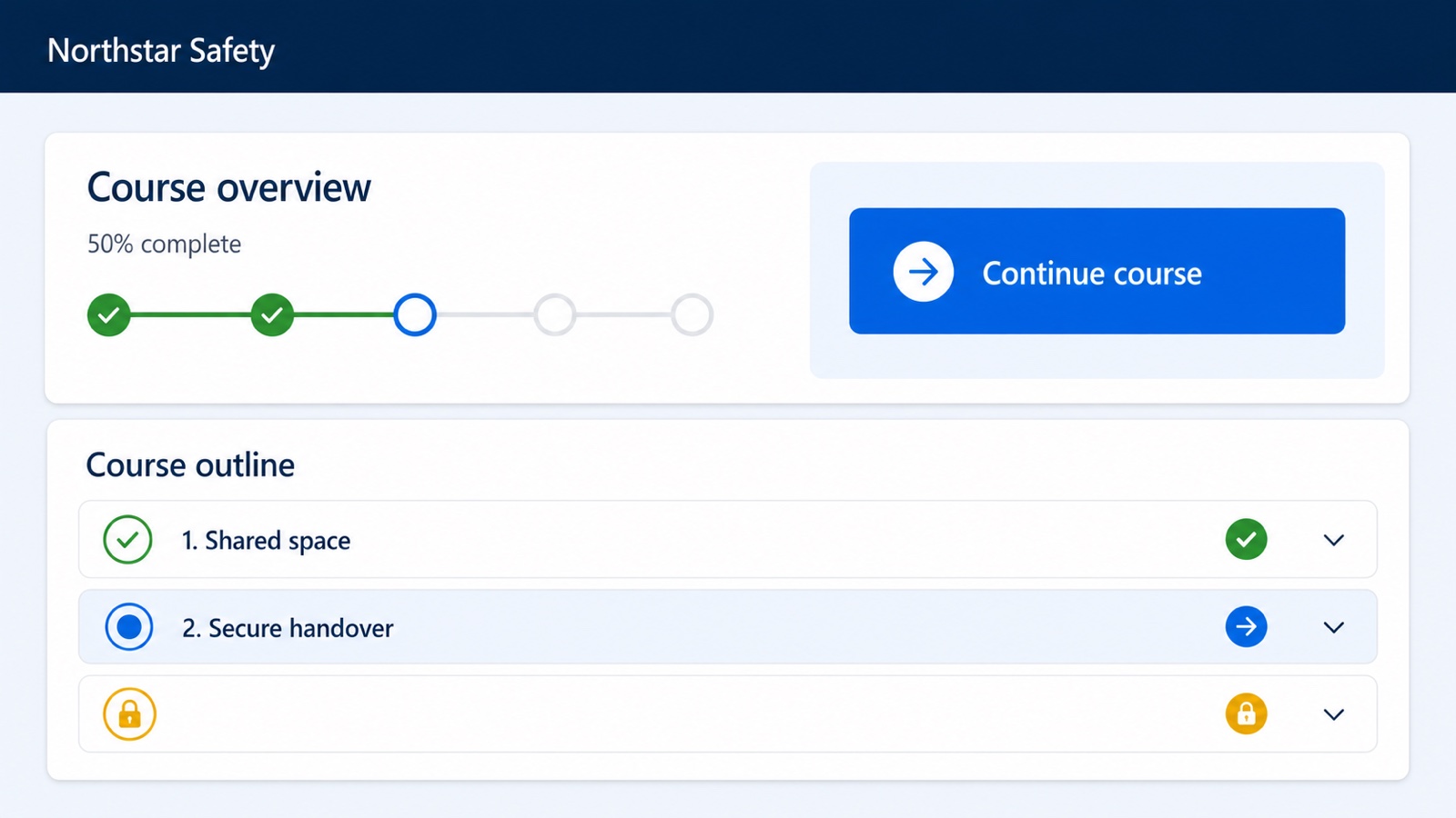
Concept mockup. The fictional content illustrates layout and hierarchy only.
A useful course overview contains:
- course title and a short plain-English purpose;
- version or release information when changes matter;
- a single continue action;
- overall progress based on a defined rule;
- an ordered course outline;
- clear completed, current, available, and unavailable lesson states;
- any prerequisite or due-date message the learner genuinely needs.
How to put it together in Power Apps
Use a summary card at the top and a vertical gallery for lessons underneath it. Each lesson row should be driven by a record, not manually copied controls.
The row needs enough information to answer three questions: what is this lesson, can I open it, and what is its current state?
If the course has modules as well as lessons, resist the urge to build galleries inside galleries until you have tested the behaviour carefully. A flatter filtered gallery, or separate module and lesson selections, is often easier to understand and maintain.
Progress should come from the completion rule, not from the width of a green rectangle. The bar is only a picture of the underlying result.
3. Lesson workspace: protect attention without hiding context
The lesson screen is where most prototypes begin, but it makes more sense once the surrounding route exists.
The learner should know where they are, what they are expected to achieve, what action is required, and what will be saved.
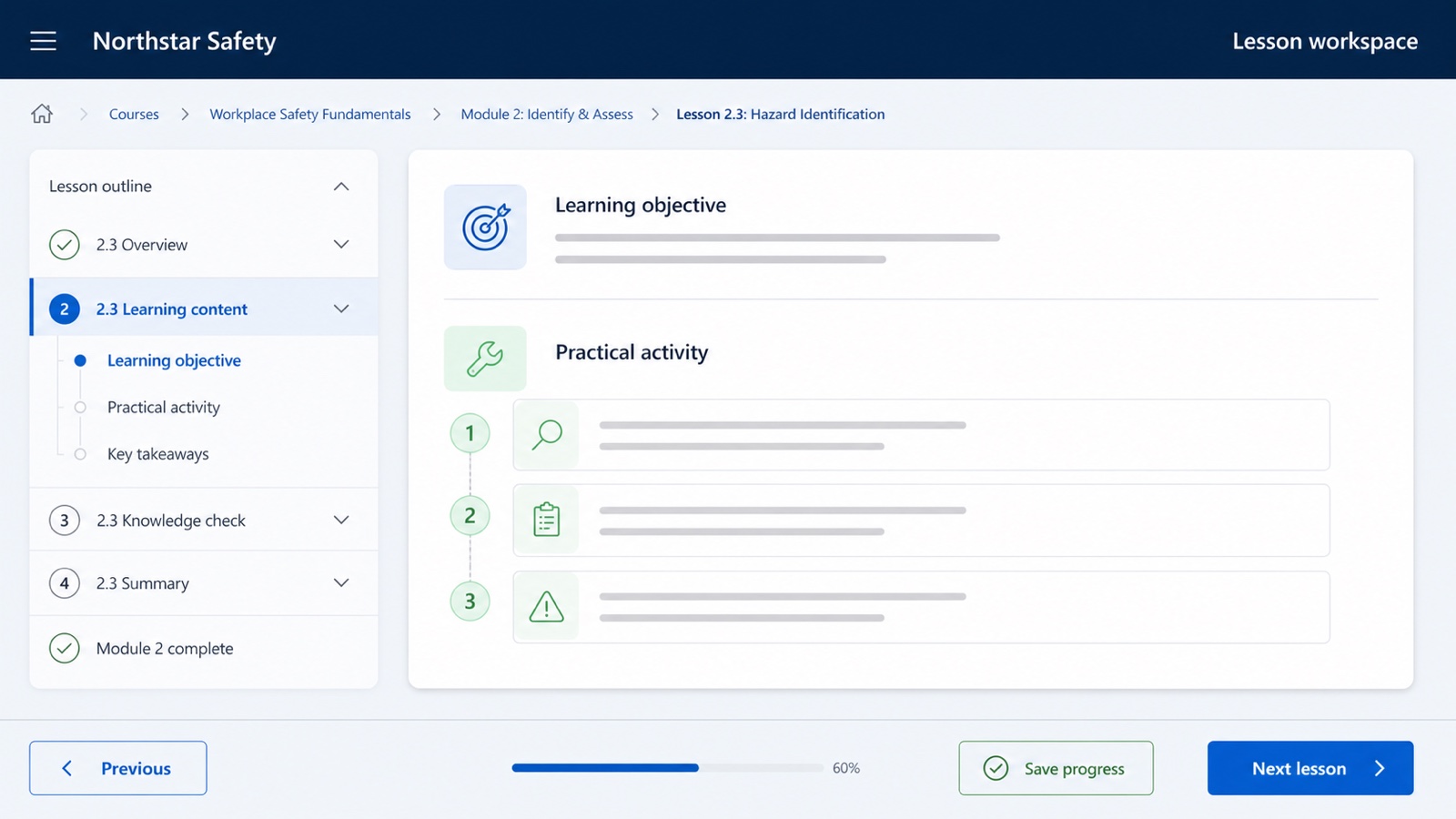
Concept mockup. It shows an interface pattern, not a tested Power Apps implementation.
The lesson workspace normally needs:
- course and lesson context;
- a meaningful title and learning objective;
- the lesson content or activity;
- previous and next navigation where sequence matters;
- a save, submit, or complete action that describes what it will do;
- feedback that says whether the action succeeded;
- a route back to the course outline.
How to put it together in Power Apps
A responsive split layout works well on a wide screen: lesson outline on one side, current content on the other. On a narrow screen, the outline can collapse above the lesson or move behind a clear course-navigation action.
Use containers for the major regions and choose controls to match the content. Text, images, video, links, inputs, and short practical checks can all sit inside the lesson region. The important design decision is not which control looks nicest. It is what the learner must do and what record should change when they do it.
Avoid a generic Mark complete button if completion actually depends on a submitted answer, an approved task, a required acknowledgement, or several activities. The button label and the stored evidence must tell the same story.
Where assessments fit
An assessment is usually a type of learning activity, not automatically another top-level area.
A short knowledge check can live inside the lesson workspace and save an attempt record. A larger assessment may deserve its own screen, attempt history, feedback view, and review state.
If you need a deep question bank, formal certification rules, proctoring, standards such as SCORM or xAPI, or complex grading, pause before rebuilding those capabilities in a canvas app. That may be a strong reason to buy or integrate with a packaged LMS instead. Our Power Platform LMS comparison explains that choice in more detail.
4. Progress and evidence: show what was actually recorded
Learners need reassurance that their work has been saved. Managers may need a record they can inspect. Those are related jobs, but they are not the same as colouring a lesson row green.
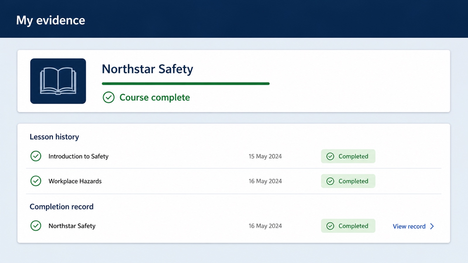
Concept mockup. It deliberately shows records rather than badges or certificates.
A progress and evidence area can show:
- the course and release the learner completed;
- lesson-level history;
- completion dates and statuses;
- attempts or feedback where relevant;
- a separate whole-course completion record;
- an explanation when the course is not yet complete.
How to put it together in Power Apps
Use a summary card for the enrolment, a gallery for lesson progress, and a display form or focused detail panel for the selected evidence record.
Keep the whole-course record visually separate from lesson history. Two green lesson rows do not, by themselves, prove that the course rule ran or that a course evidence record exists.
That distinction matters enough that we wrote a separate guide: Your Power Apps LMS Says 100% Complete. What Did They Actually Finish?.
Also design the failure path. If a learner's progress cannot be written, say that plainly and provide a safe retry or support route. Do not show success first and hope the data catches up.
5. Course management: separate drafting from releasing
An LMS also needs an owner-facing surface. It does not have to look like the learner app, and it should not share the same actions.
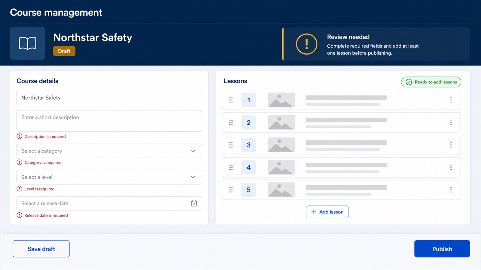
Concept mockup. It illustrates the management job without claiming a complete authoring system.
The owner needs to understand:
- which course and release they are editing;
- whether the work is a draft, ready for review, or published;
- which required fields or lessons are missing;
- the lesson order;
- whether they are saving a draft or changing what learners can access;
- what will happen to existing learners and evidence.
How to put it together in Power Apps
An edit form is a sensible fit for the selected course or release. A gallery works well for the ordered lessons. Keep Save draft and Publish visually and logically separate.
Publishing should not be a blue button that happens to set a Yes/No field. Treat it as a state change with validation, an owner, a timestamp, and a clear result. If existing enrolments or completion evidence could be affected, the interface should make that consequence visible before the action runs.
The learner screens should read a defined release. The management screen should change a draft until that release step is completed. That small architectural boundary prevents many confusing "why did the course change underneath me?" conversations.
Build the shared shell once
The five areas should feel like one app.
Create reusable patterns for:
- the app header and navigation;
- course identity and release status;
- progress display;
- loading, empty, success, warning, error, and permission messages;
- primary, secondary, and disabled actions;
- card spacing and headings.
Canvas components are useful when the pattern repeats inside one app. A component library becomes useful when the same pattern needs to be shared across apps. Keep the component's inputs and outputs clear. A header should not quietly own half the app's data logic.
Consistency is not about making every button blue. It is about making the same state and action mean the same thing wherever it appears.
Treat screen states as part of the architecture
For every data-driven area, design at least these states:
- Loading, the app has not finished reading yet.
- Ready, the expected record exists and can be used.
- Empty, the read succeeded but there is genuinely nothing to show.
- Permission denied, the person cannot read or change this data.
- Error, the operation failed for another reason.
- Saved, the requested change completed and the visible state is current.
Do not collapse permission denied, missing record, and failed connection into "Course not found". We made that mistake in our prototype. The course existed, but the signed-in account lacked the required Dataverse privilege. Here is the full diagnosis.
Make responsiveness structural, not cosmetic
Microsoft's current guidance recommends disabling Scale to fit, then using responsive layouts, formulas, and auto-layout containers so controls can resize or move with the available space.
For this LMS structure, decide the responsive behaviour for each region:
- learner-home columns can stack;
- the course outline can become a single-column list;
- the lesson outline can collapse above the lesson content;
- action rows can wrap or stack without shrinking their labels into dust;
- evidence rows can move secondary metadata underneath the main label;
- course-management columns can become separate vertical sections.
Do not assume the desktop screenshot proves any of this. Preview the app at the actual widths people will use.
Accessibility belongs in the first sketch
Microsoft's canvas-app accessibility guidance calls for readable text, sufficient contrast, logical reading order, labelled inputs, useful AccessibleLabel values, headings, and keyboard testing. It also recommends a contrast ratio of at least 4.5:1 for customised text and backgrounds.
For an LMS, also check:
- progress is expressed in text, not colour alone;
- status icons have a spoken meaning;
- course and lesson galleries describe their items;
- focus follows the visible reading order;
- every interactive label is a real button or input control;
- video has captions and audio has a transcript;
- success and error messages are announced and remain long enough to understand.
The Accessibility Checker can catch some issues. A keyboard and screen-reader review tells you whether the learning journey actually works.
A sensible build order
If we were starting the prototype again, we would build it in this order:
- Define the learning job and completion evidence.
- Write the minimum data contract and permission boundary.
- Sketch the five interface areas on paper.
- Build the shared responsive shell and state components.
- Build Learner Home and its empty, loading, and error states.
- Connect Course Overview to one fictional course release.
- Build one meaningful Lesson Workspace and save one progress record.
- Prove the whole-course Evidence view.
- Add Course Management only for the fields and release actions the owner needs.
- Test with another permitted person at desktop and mobile widths.
That sequence produces a small end-to-end learning journey. It is much more useful than spending a day polishing one lesson card while the rest of the experience exists only in your head.
What this architecture does not prove
These mockups and patterns can help you design a clearer prototype.
They do not prove production readiness, licensing fit, Dataverse security, accessibility for real users, reporting accuracy, scale, compliance, successful environment movement, or supportability.
Inside the Build a Microsoft 365 LMS with AI Learning Board explains what we built, what we observed, and where the proof stops.
If you want to work through a bounded version yourself, the paid Build a Microsoft 365 LMS with AI Board takes you from the learning job through the app, evidence, testing, release checks, and handover.
It is a guided learning route, not a promise that Power Apps can replace every LMS.
Sources
- Microsoft Learn: Building responsive canvas apps
- Microsoft Learn: Gallery control in Power Apps
- Microsoft Learn: Edit form and Display form controls in Power Apps
- Microsoft Learn: Canvas component overview
- Microsoft Learn: Create accessible canvas apps
- Canvas Student Guide: Use the To Do list across courses
- Brightspace: Navigate course content in the learner experience
- Brightspace: About Class Progress